W A L I W A L E A
WELCOME TO MY STUDENT GRAPHIC DESIGN PORTFOLIO
 |  |  |
|---|
FIRST WEBSITE POST
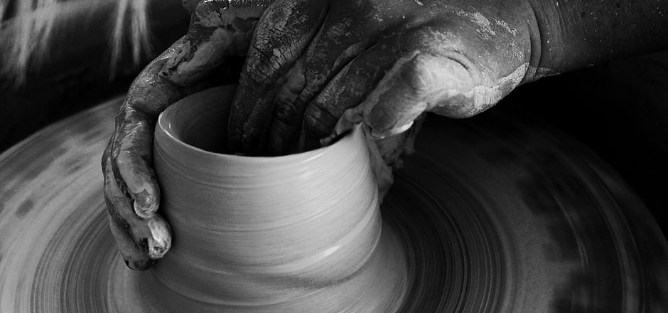
Week 1: Artisan's Hands
Observe and feel the clay, be nostalgic of the tender yet rough hands and spin around in circles with the wheel. Notice how we can listen and smell this photograph. It takes us on a psychological journey. It's different textures, the space and the motion of the picture make it appealing and easy to the eye. When editing this picture I decided to filter it in black and white because I wanted to highlight the value and luminance of the work. This is why I decided to submit this photograph for my first entry.
Questions that came up during the reading:
-Is synaesthetic the method in which, with the help of the invisible world of the senses, I can achieve an honest expression of my vision of the world and provoke the audience with it?
-Why is it that we unconsciously analyze the symmetry and rhythm of any given media form?
-What is more important to the intended audience? The image, the composition, the illusion of space, the rhythm, the emphasis, etc... or the feeling or message the artwork tried to portray?
PRINT AD DECONSTRUCTION
Week 2: McDonalds Ad
McDonalds is known to have a successful marketing and design strategy. Because of this I decided to analyze one of their ads and deconstruct its visual elements and principles. As we can observe, this ad is telling us that we can find free wifi at any McDonalds. The thing is that they translated this information into visual elements, with four fries representing strong wifi and a hamburger box representing a computer. All of this with a minimalistic style.
Color relationship is key when constructing a brand’s image, primary colors are always reliable to use. McDonalds is known to use only pure hue red and yellow as their colors, primary, solid and reliable colors that show confidence and stability. As we can observe, they use these colors on the ad except for the background on the right side image which is a tint of brown and the typography which is white. In addition, the typography used here is only one font, one in bold lettering, it looks like a medium oswald font . I believe this specific font gives the connotation that there is not much to be said other than that there is wifi and that you should come buy a burger in order for you to use their wifi, there is no decorative element in them. They show that they are concise. To capture our attention, the word Wi-Fi is intentionally highlighted with capital letters and the sentence doesn’t end with any sort of punctuation.
The ad is concordant and simple. Because of its simplicity, you are obligated to analyze it in order for you to understand what it is trying to communicate. When the fries, for example, are placed in a specific manner, such as the one above, then we can observe that it is trying to make a suggestion. The symbolism and metaphor used is quite impressive. Because unity and variety are combined effectively, there is a satisfying composition. There are only very few shapes, but the ones existent are organized lively, there is symmetrical balance.
We can note the basic one-point perspective and how all the important points of the ad are positioned on the eye level on a horizontal line. As mentioned before, the way in which the fries and the hamburger box in unity with the hand are positioned to give an illusion of the objects being something they are not. There is much definition on these images, but there is not much play in 3D space or the illusion of motion. The images also have a realistic proportion, there is not much surrealism in them. Only metaphor. What seems the most surprising is how we can hear the restaurant and smell the fries only by looking at the ad. Maybe that is the real illusion.
McDonalds is so widely known by the global community that they can afford only showing their logo on their ad. Their full name is not needed. The concepts mentioned contribute to how the viewer reads and interprets the ad's message. I like how the different bits and pieces added up to become the ad we have been deconstructing. It is one exemplar to look up to and be inspired by.


